Sunday, February 27, 2011

art museum visit 1


 I found a connection with the artwork shown above, Winter. One thing I really enjoy is outdoors. I also love having and taking picture of outdoor scenery. I believe that winter, along with fall, is one of the prettiest times of year. When I saw this painting, I really wished I could hang it on my wall at home.


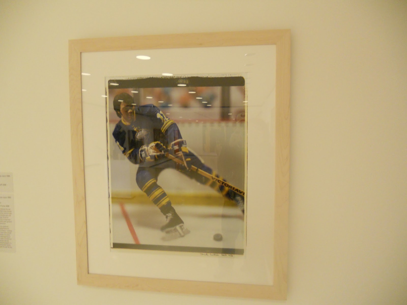
I also found a connection with the photograph above. Hockey and the sabres are on the type of my interests list. I love watching and going to games. My family is really big on hockey and a few family members play hockey, therefore it is a big part of my life.


I would really like to know more about this painting. It is of a servant girl, but the picture looks like there is so much more to it. The blocking out of her eyes might show that she has no identity. She also has a very depressed look on her face, in my opinion. I would like to know what inspired this painting.


This painting really caught my eye because of how unattractive the girl is. I then looked more and ihere was a monkey, which I thought was cute. Maybe there is a meaning to that, which is why I would like to know more about this painting.


This painting above really inspired me. This painting is done in all little splottches of different colors of paint. If you look close, you can tell in person. But in the picture and from far away, it is inspiring how tiny splottches of paint can create such a beautiful picture.


This exhibit room was a little creepy. I would like to know more about this work of art. The room was very empty but had a couple tvs with floating objects. Im not sure why it creeped me out but I also found it really unique and wanted to know more.


The picture above of this painting does not do it justice. I found this painting inspiring. Moses used techniques that really made the painting look like real velvet, it was very impressive. I almost had to go up to it and touch it to make sure it really wasn't.


This painting also inspired me. It looked very real and made me think about the concept of it. I thought back to the time of "indians" and thought how inspiring it was of them to do the primal things they did to survive. It really made me think how easy we have things now a days.


I found a connection with this painting, The Coming Storm. It is very dreary and even frightening. Sometimes, when I am having a bad day I can picture this to be my life. I sometimes feel like a big frightening storm is about to come and I need to relax and keep my head on straight.

Saturday, February 26, 2011

logo design

1. Discuss what you thought about creating your logo.
2. Describe the process: creative thinking skills and ideas you used in the logo creation.
3. What was the most important discovery you made in the creation of your logo?
4. What is the most important information you learned from watching the videos, powerpoint, and reading material  for this project? What is your opinion of the videos?

1. While I was creating my logo, I was thinking about myself and my personality. It was sort of cool because I have never done something like this before and it was interesting to try to describe myself in one picture.

2. First I watched the videos and checked out the different websites that talked about logo designs and graphic designers. Then I did some brainstorming as shown in my picture. I thought of all the things I liked or enjoyed doing. I timed myself and those things listed were the things that came to me in 60 seconds. I thought that would give a good simple description of how I view myself. After that I started sketching, with no concrete idea of what to do. I finally picked my logo and made a hard copy in my favorite colors. The quote is a line from my favorite show, Jersey Shore. I love martinis and I am sometimes like a firework.

3. I realized that most of my likes that I thought of in 60 seconds were very materialistic. I really dont think that is a total picture of me looking back. I am very well rounded and care about school a lot more than those brainstorming ideas show. I am a hardworking A student, but I do like to have fun most of the time.

4. I never realized how much goes into a logo. The video of DAG and Blue Navy was very interesting. They must go through so many designs in order to get one hard copy. It takes a lot longer than I thought it would and the end logo wasnt even that involved, from the outside viewer that is. It had a lot of meaning to it and unless you really rearched it, most people probably will never know what it stands for.


Saturday, February 19, 2011

new blog

1. Discuss what you thought about creating the Value Scale and Color Wheel.

Creating the value scale was actually harder than i thought it would be. It was hard to get the right shades, but I think I did pretty good. I used a charcoal pencil. The color wheel I had fun doing. I havent painted since elementary school so it was fun. It was hard to find cyan paint though.

2. Which media did you enjoy working with the best and why?

I enjoyed using paint better. It was more colorful and easier and plus, I havent painted in years and it brought back memories.

3. What was the most important discovery in the creation of these studies?

The most important thing I found out was that it is hard to create a value scale. I thought that would be the easiet of the two but it took me a few tries to get it done.

4. What is the most important information you learned from watching the videos for this project? What is your opinion of the videos?

I never knew about the colors yellow magenta and cyan being primary colors until watching the video. I had always believed it to be blue yellow and red! So that made the videos more interesting!


Saturday, February 12, 2011

Project 1

Below I have listed the elements and princliples of art. I have also indicated which picture represents which element and an explanation of why I chose to portray it this way.

Form: For this element, I took a picture of the inside of a cup. It is 3-Dimensional and encloses volume.

Line: To show line, I took a picture of a desk drawer. It is an implied 3 dimensional picture. It has lines to show the outline of the drawer.

Shape: I took a picture of a ping pong ball to show shape. It is round and shows the shape of a circle.

Color: I took a picture of a poster I have that is very colorful. It is similar to Andy Warhol's Campbell Soup work. I thought that poster would work well for this project.

Texture: For this picture, I took a shot of my favorite blanket. It is very worn and torn, but I do love the texture of it.

Space: I have a picture of the cupboard door open. This I used to show the space between the doors.

Value: For value, I took a picture of a chair. The lightness and darkenss of the brown sheet shows the wrinkles. It sort of makes it like 3-dimensional.

Emphasis: To show emphasis, I took a picture of a label. The word lager is emphasized because it is larger and stands out.

Balance: For balance, I took a picture of my tv stand. I have three candle holders of about equal size and they are pretty equally spaced on the tv stand.

Harmony: I have a picture with 4 darts, two blue and two red. The picture is very simple because they are all the same objects.

Variety: To show variety, I took a picture of my bookcase. It has a variety of games and boxes of all different colors, shapes, and sizes.

Movement: To show movement in a picture, I used a person jumping. All you see is their feet in the air, but it gives the picture some excitment.

Rhythm: I used a picture of a dart board to show rhythm. The dart board has repeating colors and shapes throughout.

Proportion: With this picture, I gave a sense of the size difference between the two pop bottles.

Unity: I took a picture of three flowers. Seperately they make three flowers, but together they form a bouquet.

Friday, February 11, 2011

Blog 3

1. The book states that color affects people on a basic level. It is defined by culture but also very personal at the same time. Color affect people more than we know or realize it. We are used to everyday things being certain colors and we don't really realize how dependent we are on that until things are changed, which is what the interactive demonstration on the provided website showed us. What would you do if you ran into a green stop sign? or had blue colored food. Certain things are certain colors for particular reasons. Colors have multiple meanings, "cool colors" are calming, such as blues, but blue is also used as supressing your appetite. Artists use color and its effects on emotions to their advantage and to express feeling through their work.

2. Color is used alot with psychology. I think this really is interesting that somehing so simple as color could help in such a big way. Color affects how people feel, think, what they do, and how they do it. Color can be used to influence peoples actions as well as making you feel certain ways. I just find that very fascinating.

3. At the end of the video, the woman finally got the colors she wanted to express her painting of Venice. She said that is the hardest part is getting the colors correct because her paintings are about feelings.She also stated that color is very psychological and has a lot of symbols and meanings. I thought that was important. Color is only one small aspect of a work of art but it means so much.

4. An important aspect I found important was about Goya and David. They both use feelings in their paintings and both are of sad and dark nature. This i believe coincides with my answer to number three. These artists, like June, take a lot of pride in the colors that use in their paintings and that is how they show feeling and depict emotion in their work.

Friday, February 4, 2011

Blog 2

1. The first video went through many different philosopher's theory on aesthetics. It basically broke down different eras and described where the term aesthetics came from, starting way back with Plato and Aristotle. In 1700, the actual term was coined by a German philosopher named Alexander Baumgarten. It then goes into how it is affect by technology and much more. The video also went into detail about art and how it doesnt have to beautiful in order to be called art because it really is just someone expressing an emotion. The second video was of two lectures, the first being Changeux. He spoke about "Rules and constraints of artistic creation: the neurobiologist viewpoint."  He explains how when people view art it comes from our brain's activity and how aesthetics is also scientifical. Ramachandran also believes our brain interprets art, but it comes to us over time throughout our life. He explans the science of art and how humanities and science meet in the brain and art is where it starts.

2.I believe that the most important theories on aesthetics are the earliest ones, such as Plato. Plato was a Greek philospher, in Fifth Century Athens. He felt that beauty was found in  works of art which contained harmony and unity of its parts. This is important because it laid the grounds for art and works of art.

3. I found Ramachandran more interesting. He gave stories and connected facts with real life situations and made it a lot more easier to pay attention and understand. I do agree with art science being connected by the brain, but i like to think of art as personal and shouldnt be thought of as so complex as these scientists try to do.

4. I thought the first video was related to chapter two in the text. It explained how art doesn't have to be beautiful, while the book agrees by saying "If we take pleasure in what we see, we say the peach is beautiful." The second video is sort of a different way to think about art. Not dealing with theories but relation it to science and the brain.

5. I thought the first video was more dull compared to the second one. The first was all about the history and went into more depth than we can read in the book. The second I enjoyed Ramachandran. He was a lot easier to understand and I like that they show art in different ways and compared to science.