1. What were you expectations for this course and where they met?
2. Now that you've been through this course, What is art? How would you define it now compared to your intial posting?
3. Who was your favorite artist in your original posting and who is your favorite visual artist now? If there is a difference, why do you think so? If you have the same favorite artist, why do you think so?
4. Now that you've completed this course, how do you feel about taking an online course? Is your answer the same as it was in your first posting? How is it the same or different?
1. In my first blog, I stated I wanted to learn about art and hopefully crete art. I did learn much about art from the book and video. I also got to create different types of artwork, which was my favorite part of the course.
2.I would describe art the same way I think. Art can be anything. You can make art out of anything, just use your imagination and create art as you want. I learned this by the different project we did throughout the semester and also checking out other people's projects, everyones was all different, yet it was all art in its own way.
3. I didnt have a favorite artist before because I havent really learned about art much before this, but now my favorite visual artist would be Paul Pfieffer. We didnt learn about him through the book, but I saw his exhibit at Albright Knox, In the Zone and it really caught my eye and I remember all the information I read about him and it stuck with me.
4. I stll enjoy taking online courses. You learn at your own pace and do the work on your own time. It did take me a while to get organized and remember when things were due, but there was a pattern and I tried my hardest to follow it, but I did lose some points for turning things in late, which was my own fault. But overall it was a great semester and I enjoyed the course.
Wednesday, May 11, 2011
art galler visit 3
For this gallery visit, I chose to go to the Burchfeild Penney. They do not allow picture to be taken, but i did explore some self portraits there.
I saw two self portraits there and one at the Alrbight, which I have a picture below. The other two that I dont not have pictures of, I have the information for.
1. Lars Gustaf Sellstedt, Self Portrait, 1899, oil on canvas
2. William John Wilgus, Self Portrait, c. 1837-1842, oil on canvas
Both of these men were important to Buffalo's history so I found them pretty interesting.
3.


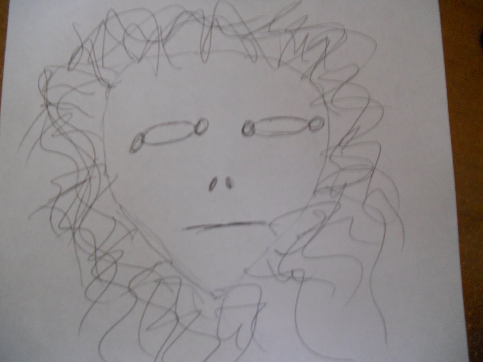
Lastly, I tried to draw a self portait of myself. I did a horrible job and made myself look very creepy.

Step #6
Create a reflection journal on your Blog and answer the following questions:
1. Why did you select the inspiration pieces?
I selecte the inspiration pieces at the Burchfeild because they were people who were important to Buffalo's history. They also were very realistic and non abstract portraits. I chose the one from Albright Knox because it was abstract and I wanted to have different inspirational paintings to be able to have a variety of styles to chose from.
2. Why did you select the media to create your self-portrait?
I once drew a self portrait in freshman year of highschool and it turned out pretty good. I wanted to draw myself because I wanted to see if I could still do a good job, which I learned I cant.
3. What challenges did you face in creating your self-portrait and how did you overcome them?
It is very hard to judge how big your face is and how big your features are and where to put the features on the face. If they are the slightest bit off, it will through the whole picture off. I tried a couple times and didntovercome this problem, therefore my drawing looks the way it does.
4. How does this piece represent you?
I did my best to represent myself. I love black and white photos therefore I didnt want to draw in color and I only used a charcoal pencil. It doesnt really look like me , but i tried my hardest to copy the picture of myself. I chose a picture with a silly face because thats my personality, silly and outgoing.
5. What elements and principles of art did you apply in this work?
I used lines for my face and hair. I also used value of blacks and grays to do the shadowing in my face. I also used shape for my eyes.
6. Did you enjoy working on this project?
I enjoyed doing this because it was a challenge. I thought it would be pretty easy, but i was wrong. It was hard to draw my face to match the picture and like I said earlier it was hard to place my features in the right spot. I did enjoy doing it though, as I did most projects this semester.
7. What do you think of your final artwork?
I think my final artwork is pretty funny. It is a bad drawing, but it is amusing and makes me look very creepy!
I saw two self portraits there and one at the Alrbight, which I have a picture below. The other two that I dont not have pictures of, I have the information for.
1. Lars Gustaf Sellstedt, Self Portrait, 1899, oil on canvas
2. William John Wilgus, Self Portrait, c. 1837-1842, oil on canvas
Both of these men were important to Buffalo's history so I found them pretty interesting.
3.


Next, I took a photo of myself to use as a reference for my drawing:

Lastly, I tried to draw a self portait of myself. I did a horrible job and made myself look very creepy.

Step #6
Create a reflection journal on your Blog and answer the following questions:
1. Why did you select the inspiration pieces?
I selecte the inspiration pieces at the Burchfeild because they were people who were important to Buffalo's history. They also were very realistic and non abstract portraits. I chose the one from Albright Knox because it was abstract and I wanted to have different inspirational paintings to be able to have a variety of styles to chose from.
2. Why did you select the media to create your self-portrait?
I once drew a self portrait in freshman year of highschool and it turned out pretty good. I wanted to draw myself because I wanted to see if I could still do a good job, which I learned I cant.
3. What challenges did you face in creating your self-portrait and how did you overcome them?
It is very hard to judge how big your face is and how big your features are and where to put the features on the face. If they are the slightest bit off, it will through the whole picture off. I tried a couple times and didntovercome this problem, therefore my drawing looks the way it does.
4. How does this piece represent you?
I did my best to represent myself. I love black and white photos therefore I didnt want to draw in color and I only used a charcoal pencil. It doesnt really look like me , but i tried my hardest to copy the picture of myself. I chose a picture with a silly face because thats my personality, silly and outgoing.
5. What elements and principles of art did you apply in this work?
I used lines for my face and hair. I also used value of blacks and grays to do the shadowing in my face. I also used shape for my eyes.
6. Did you enjoy working on this project?
I enjoyed doing this because it was a challenge. I thought it would be pretty easy, but i was wrong. It was hard to draw my face to match the picture and like I said earlier it was hard to place my features in the right spot. I did enjoy doing it though, as I did most projects this semester.
7. What do you think of your final artwork?
I think my final artwork is pretty funny. It is a bad drawing, but it is amusing and makes me look very creepy!
Tuesday, May 10, 2011
extra credit
COURSE CONTENT
1. Which assignment did you ENJOY working on the best? Why?
I enjoyed making the mask the best. I thought it was something that I never get to do anymore, being older you never get a chance to be creative and just enjoy doing something simple and fun.
2. Which assignment did you ENJOY working on the least? Why?
4. If you had the opportunity to change this course:
5. Would you recommend this course to your peers?
6. Please list any other comments you would like to share.
1. Which assignment did you ENJOY working on the best? Why?
I enjoyed making the mask the best. I thought it was something that I never get to do anymore, being older you never get a chance to be creative and just enjoy doing something simple and fun.
2. Which assignment did you ENJOY working on the least? Why?
I enjoyed the video blogs the least. It was very very time consuming to watch the videos and write a review on each one every week. I think I would have enjoyed it more if it wasnt every week and only once in a while.
3. How did you like using ANGEL?
I like using angel. I have taken many online courses and courses that use angel so I am very comfortable with it. It is nice to turn thing in online rather than in person and it allows you to do work on your own time.
4. If you had the opportunity to change this course:
What would you keep? I would keep the course discussions because it actually makes you read the book and chapters and think about the content. I would also keep the projects because I liked and enjoyed doing things with paint and drawing and things like that.
What would you remove? I would remove all the gallery visits because it was time consuming as well and hard to fit it in my schedule with school and work. It would have been nice to just go once and get all the information I needed to the first time around. I would also remove some of the video reviews.
What would you add? I would add some more projects because I think it give the student a way to show their creative side.
5. Would you recommend this course to your peers?
I would reccommend it because it was an enjoyable class.
6. Please list any other comments you would like to share.
The only comment I would have is that it is a very demanding course, being a 200 level art elective. It was a lot of work and there was a lot due throughout the week, it was hard to get it all done and remember to turn things in on time, considering there is a 25% late fee. Other than that is was a good semester and I enjoyed learning about art.
art criticism journal
1. Which projects did you review?
I reviewed Karen Hill's Paper or Plastic, Jamie Milligan's All the Small Things, and Dan Collin's The Art of Nature
2. Why did you select the Exhibit you critiqued?
I selected Paper or Plastic because I thought the title was catchy and it was a very different and creative idea.
3. What challenges did you face in writing the critique article and how did you overcome them?
At first I thought it was going to be difficult to write two pages on the exhibit because I wasnt sure if we were critiquing each piece or the exhibit as a whole. I thought that the curator was supposed to analyze and describe each art work so therefore I did it as a whole and was able to make it long enough byt not exceed three pages.
4. How do you feel about critiquing your peers work?
I dont really like to critique other people because I feel bad about saying things that I find that I dont like. I feel like I wouldnt want other students to think bad about my work therefore I dont like to say anything about theres. But, critquing is different because its more opinion and constructive than being destructive.
5. Would you like to read the critique your peers wrote about your Art Curation Project?
I wouldnt like to read a critque on mine.
6. On a scale of 1-10 how would you rate your finished article and why?
9 I feel like I included everything that I needed to and I also painted a picture of the exhibit by describing it and if people only read the article without veiwing it, they would be able to picture it in their head.
7. Did you enjoy working on this project?
I did enjoy this project because it gave me a chance to see other students hard work on the big project. I know I put a lot of effort and time into my project so it was nice to see otehrs as well.
video review
Greenberg on Art Criticism: An Interview by T. J. Clark
This video was basically Greenberg speaking about all types of topics. He talked about art criticism and how it is harder to write about art than literature and music because art is mostly abstract now days. He spoke about other art critics such as Ruskin and Degaro. He also spoke about his own writing and the things he liked to write about back in the 1940s. I think this video may be related to our art criticism project depending on the project we pick to critque. This video talked a lot about modern and abstract art.
Greenburg on Pollock
This video was similar to the first video because it was an interview with Greenburg. Instead of discussing art critics, he discussed Jackson Pollock. The first half of the video is bascially about Pollock and easel painting. Pollock didnt want to consider himself an easel painter. He wanted to transition to mural painting, but Greenburg stated he did easel painting til the end. The second half was about his technique and what worked and didnt work. Also about his realization that his work was never considered a painting. This i dont think really pertained to the project very much because we are not going to be criticizing the life of the curator, just one project.
Introduction to Italian Renaissance
This video was about the Giorgio Vasari's Lives of the Artists. It was the basis of art criticism since the 16th century. Vasari and his apprentice discuss the different artists, from Giotto, Botticelli, daVinci, Donatello, and how they learned from the people before them. This was written about the Italian REnaissance and they discuss in the video about how they used Italian influences in their work. I think this is related to the project because it is a art critics piece so we can see what an art critic really does first hand.
The Critics: Stories from the Inside Pages
This video is basically the likes and dislikes of art critics. It goes through what art critics really do and is opoinions from both sides, the artists and the critics. Critics believe they keep artists on their toes and may give them the break they are looking for but artists believe show they negative aopinions toward them. The video goes in depth about art criticism as an art, its social value, and how reknowned critcs got to be where they are. I think this helpw ith the project because it puts us in the mind set of becoming a critic for the project.
The Colonial Encounter: Views of Non-Western Art and Culture
The title basically explains this video good. It talks about the world fair and how it showed its nationalistic feelings. When it was held in France, half of it was French art. It then goes into colonialism and how it is justified because of the violent tendencies of the african.The video also spent a lot of time on Dahome and art vs. material culture. I didnt really see how this tied into our project because although it was criticising the world fair, it wasnt doing much else related to the project in my opinion.
Jackson Pollock: Michael Fried and T. J. Clark in Conversation
This was a video about the discussion had between T.J Clark and Michael Fried about two of Pollock's works, Autumn Rhythm and Lavendar Mist. They tried to find common ground. Clark believes Pollock was more abstract whilfe Fried believes he was focused on pictoral elements. I thought this one was interesting to watch because it was almost like a debate. It also shows contructive criticism from two people. This helps to show that for the project that criticism is not right or wrong its the way you go about it and it can be different for everyone.
Saturday, May 7, 2011
art curator project
When we were assigned this project, I knew right away what my theme was going to have to do with nature. It wasnt until after I started looking for pictures that i decided how to set up the exhibit. As I was looking at the different artists' nature scenes, I liked how the artists had a variety of works. Artists didnt just pick one type of scene. So for the project I decided that I would use to paintings from each artists and they would be opposites of eachother. For example, if one was a winter scene, the other would be a summer scene, if one was a water scene the other would be a land scene etc. I thought this would give variety but also unite the paintings under nature. Instead of all painting being of one thing, i made sure there were opposites.
For my exhibit I hused white backgrounds and black font. This I thought would keep the attention on the painting rather be distracted by other things. I also used a font easy to read so the viewers experience would be as simple as possible. I bolded the artist name and italicized the title of the work. I also moved the painting around on each slide so it would give the exhibit a little variety as well, but not take aways from the works. I found all my painting from the AskArt link in the course resource file in angel, therefore I didnt post the website on each slide. I also used a couple photos of painting that I viewed while at Albright Knox.
I enjoyed doing this project because it gave me all the power and authority to do what I wanted. I could go any way I wanted with my exhibit and I was the creator and could used my imagination.
Friday, April 29, 2011
video blog
This is the second time I had to write this because I pubplished it and it all was erased for some reason. :(
The Lowdown on Lowbrow: West Coast Pop Art
This video was all about the Lowbrow, also known as pop surrealism. The era was influenced by different things in pop culture at the time, such as rock and rool and comic books. The video is basically about interviewing curators and explaining what lowbrow was, how it started and what it meant to the artists and curators. It contained information on how it adapted from surrealism and how women were introduced as well. It also went throught the different phases and artists of the time. I found most interesting was the part about how it was percieved in the music industry through punk rock and how artists used cd and album covers to display their work. It really didnt have much to do with my project though.
George Eastman House: Picture Perfect
THis video I found interesting because I never knew how close George Eastman lived to Buffalo and knowin that the museum is right in Rochester, its only a short drive if I ever wanted to go visit it. The video starts by talking about the house and the contributions the he and Kodak has made to the photography world. It explains how he was the first to invent an affordable camera and how that was like a revolution for the time. I found it most interesting that the video showed the different rooms of the house and how there were pianos in still working condition and everything aftert all these years.I also hound it interesting that the George Eastman house contains about 5,00 cameras!
Tate Approach
I thought this video was a good video to watch while having to do project four. Although for the project we do not have to place art on display, it is really interesting to think about how I would actually go about doing this and if I would use the Tate Modern approach for my exhibit.The video starts by talking about the Museum for Modern Art and how the art was displayed in chronological order and by era. It then talks about how the Tate approch was something different and was displayed int themes. I found it most interesting that the 4 themes were history, nude, landscape and still life. I didnt get to finish the movie because it kept freezing at the end.
Bones of Contention: Native American Archaeology
I found this video the most interesting. It was different than the other three videos in that it was more scientific and instead of art such as paintings and photographs, it was artifacts and bones. I can relate it to my project becase my theme is things in its natural habitats. Buried bones and artifacts in a sense are found from their natural habitats andthat is basically what the whole video is about. It was a dillema wheter these bones should be studied or put back and buried with their ancestors. Although there was a lot of controveries, both the natives and scientists have learned a lot from the bones and most bones needed to be studied in order to put back with their right ancestors, therefore in my opinion, it is benefitial to study the remains.
Saturday, April 23, 2011
video blog
Andy Warhol
I chose this video because when I was younger in like 2nd grade I had to do a project just like the campbells soup painting, but mine was with pringles cans. I learned a little about him and thought it would be interesting to watch a video on him. The video goes through Warhols life and also the movement of pop art. It starts with his interest in Marylin Monroe and Elizabeth Taylor. After her death, he used Marylins motif of her face and reproduce it using silk screening. The video then shows how silk screening is done. Warhol evolved from just using silk screening but began used paint on his silk screened images. He was also known for being a journalist. The video also highlight his famous work, Ten Lizes. My favorite part was learning how he was interested in Monroe and Taylor, because I too am interested in them.
Sculpture of Space
This video I chose because when i opened the link up it looked interesting. I think sculpture are the most interesting form of art so I wanted to learn about it more. The video basically goes through the life/career of Isamu Noguchi. He is a sculptor and focuses on gardens and has worked all over the world. What I found most interesting was to find out about his poverty. This shows he had determination and never gave up. His career in America really started when he was asked to redesign Miamis's Bayfront Park. H ran into obstacles, but he used them to his advantage to really plan out his work. His work is really interesting to look at especially his water sculpture. The video ends with friends of the artist discussing his work and life.
Henri Moore
I chose the video on Moore because he is a modern artist and I like to learn about modern art or things that I could relate to. The video really brings his career to life. It basically brings attention to his different works from drawings to graphics to monuments. It starts with giving an overview of his childhood, from what inspired him to his talent at drawing. Later on this helped him because he used his drawings to to generate ideas for sculptures. It ends with how he has influenced others over the years. What I found interesting were the drawing he made of his own hands. I was able to relate to that because of the project we did earlier in the semester.
Abstract Impressionism and Pop Art
I chose this video because I like pop art and I wanted to expand what we had read inb the chapters this week. The video goes through the two eras of art during the 1950's - 1960's. Starting with Impressionism, the video explains the movements and the differetn artists who made an impact of during the era, such as Franz Kline, Helen Frankenthaler, and Jasper John, who we read about in the book. Jasper John I found most interesting because I remember reading about him and thinking that his art is simple yet interesting and I like that he used everyday objects. The video then turns to Pop art and Andy Warhol, the leader of the era. It also talks about Roy Lichtenson as well.
Sunday, April 17, 2011
art gallery visit 2
Albright Knox Visit
Step 1: The Exhibition

Questions about the exhibit:
1. What is the title of the exhibit?
Pipilotti Rist: Dwelling (within)
2. What is the theme of the exhibition?
The exhibit was supposed to engage the viewer by offering a meditative and tranquil atmosphere rooted in elements of domesticity. It contained three pieces, pictures are shown below.


Step 2: The Gallery
Questions about the physical space:1. What type of lighting is used?
There are lights on the ceilings, mostly all had a yellowish tint to them. Also there were lights directed toward the pieces to help them stand out.
2. What colors are used on the walls?
The walls were all white. This was probably done to help not distract viewers from looking at the art and help the art stand out from the walls.
3. What materials are used in the interior artchitecture of the space?
The architecture was all basically white as well as the walls to keep the art the most important part of the gallery.
4. How is the movement of the viewer through the gallery space?
It is easy to get around. The hallways were all wide and open and everything was spaced out so it was not overcrowded.
Step 3: The Artwork
Questions about the artwork:1. How are the artworks organized?
Most were organized by the type of art that they were. There were sections such as pop art and others. Some were organized by artist as well.
2. How are the artrworks similar?
3. How are the artworks different?
4. How are the artworks framed?
5. How are the artworks identified and labeled?


 Description: It is a painting of the word electric. The background is bright blue and the word is yellow and orange. It is in all capital letters. The word is also centered.
Analysis: The painting uses bright colors, orange and yellow is used for the word so it stands out from the blue background. Emphasis is on the word due to the bright colors. It is unified and balanced because the word is centered on the painting and the letters are evenly space apart.
Bracketing: The artwork reminded me of other artists during the pop art movement. It reminds be of pop art because it is unique and bright and sticks out because of the color selection. It is simple and there is not much to it
Interpretation: I think this artwork was made to be simple. There is not much to decifer from it because it is very plain. There are three colors and one word. The artist is known for word paintings and the words he picked were alluding to pop culture and life in LA.

 Description: This painting contained 121 numbers all indifferent colors. The numbers are in rows and columns of 11 down and 11 across. each number is basically "enclosed" in its own square, each having different colored background.
Analysis: The painting uses many different colors to distinguish the different numbers from the backgrounds. It has variety because of all the different colors used. It is balanced because each number is placed in its own little square, each being the same size.
Bracketing: This sort of reminds me of Andy Warhol's Campbell soup cans because of how it is put together. Each number has its own space and box of equal size. This is just like the campbell soup cans. There is also an equal number of rows and colomns and it is set up just like Warhol's painting.
Interpretation: This was considered pop art as well, although Johns was sometimes considered a dadaist. He is known for his classic iconography. He uses everyday items in his paintings such as numbers and letters and elevated them to art.
What did you think of visiting the Gallery and purposefully looking at the exhibition from a different perspective - the physical space, the architecture, theme, etc.?
It was a different experience this visit from my first visit. I paid attention to all the little details that go in to making and creating an exhibit. It was interesting because normally you just look at the artwork, but by looking into all of the details, you see why the artwork stands out so much. Thinking about it, there is so much thought and precise decisions that go into creating a gallery in order for the viewer to get the ultimately ideal visit every time they go. It was just a different experience. I enjoyed it.
Below are some other art works that I found interesting while I was there:


Step 1: The Exhibition

Questions about the exhibit:
1. What is the title of the exhibit?
Pipilotti Rist: Dwelling (within)
2. What is the theme of the exhibition?
The exhibit was supposed to engage the viewer by offering a meditative and tranquil atmosphere rooted in elements of domesticity. It contained three pieces, pictures are shown below.


Step 2: The Gallery
Questions about the physical space:1. What type of lighting is used?
There are lights on the ceilings, mostly all had a yellowish tint to them. Also there were lights directed toward the pieces to help them stand out.
2. What colors are used on the walls?
The walls were all white. This was probably done to help not distract viewers from looking at the art and help the art stand out from the walls.
3. What materials are used in the interior artchitecture of the space?
The architecture was all basically white as well as the walls to keep the art the most important part of the gallery.
4. How is the movement of the viewer through the gallery space?
It is easy to get around. The hallways were all wide and open and everything was spaced out so it was not overcrowded.
Step 3: The Artwork
Most were organized by the type of art that they were. There were sections such as pop art and others. Some were organized by artist as well.
2. How are the artrworks similar?
They are similar because most are hung on the walls and are at eye level basically and evenly spread apart. The materials used to paint were a lot the same, for example there were a lot of oil on canvas paintings.
3. How are the artworks different?
They are different because no work, sculpture, or painting is the same. Each is very different from eachother.
4. How are the artworks framed?
The artworks are framed and hung on the wall. If the paintings were part of the same exhibit or by the same artist, they were mostly in the same frames. Others were very different frames. There was no specific uniform frame.
5. How are the artworks identified and labeled?
Each artwork had a small plaque hung on the wall next to it. The plaque had all the information needed to identify the art, such as artist, origin, date, materials, etc.
For example:

6. What is the proximity of the artwork to each other?
The artwork hung on the wall was spaced out well, most were evenly distanced and hung about the same distance from eachother. They were spread out so it was easy to look at one without getting distracted by the next.
Step 4
Art Criticism


Description: The painting is of 100 cans of Campbells soup. Each can is exactly the same. The size and dimensions are exactly the same and they look very realistic to real cans of campbell soups.
Analysis: The painting uses bright colors such as red and yellow to make the cans match the real colors in a can of Campbells soup. They are also shaped just like real cans. Lines are used to form the outline of each of the 100 cans. Proportion was used to show that they are the same size to eachother and a real can. It is very unified because each can is exacly the same. The painting is balanced because it is symmetrical. There is rhythym because each is the same and forms a pattern.
Bracketing: When I saw this, it reminded me of when I was younger. I once learned about pop art and andy Warhol while I was in elementary school. I had to make a drawing based off this painting, but I used pringle cans instead of soup cans. It also reminded me of Wayne Thiebaud's Three Machines, the gumball painting.
Interpretation: This painting was based on Warhol's original painting which had 32 soup cans.He based it on themes of pop culture of the time and it began a famous art movement called pop art. He used this to express his positive view of modern culture.


Analysis: The painting uses bright colors, orange and yellow is used for the word so it stands out from the blue background. Emphasis is on the word due to the bright colors. It is unified and balanced because the word is centered on the painting and the letters are evenly space apart.
Bracketing: The artwork reminded me of other artists during the pop art movement. It reminds be of pop art because it is unique and bright and sticks out because of the color selection. It is simple and there is not much to it
Interpretation: I think this artwork was made to be simple. There is not much to decifer from it because it is very plain. There are three colors and one word. The artist is known for word paintings and the words he picked were alluding to pop culture and life in LA.


Analysis: The painting uses many different colors to distinguish the different numbers from the backgrounds. It has variety because of all the different colors used. It is balanced because each number is placed in its own little square, each being the same size.
Bracketing: This sort of reminds me of Andy Warhol's Campbell soup cans because of how it is put together. Each number has its own space and box of equal size. This is just like the campbell soup cans. There is also an equal number of rows and colomns and it is set up just like Warhol's painting.
Interpretation: This was considered pop art as well, although Johns was sometimes considered a dadaist. He is known for his classic iconography. He uses everyday items in his paintings such as numbers and letters and elevated them to art.
What did you think of visiting the Gallery and purposefully looking at the exhibition from a different perspective - the physical space, the architecture, theme, etc.?
It was a different experience this visit from my first visit. I paid attention to all the little details that go in to making and creating an exhibit. It was interesting because normally you just look at the artwork, but by looking into all of the details, you see why the artwork stands out so much. Thinking about it, there is so much thought and precise decisions that go into creating a gallery in order for the viewer to get the ultimately ideal visit every time they go. It was just a different experience. I enjoyed it.
Below are some other art works that I found interesting while I was there:


Friday, April 15, 2011
video review
This week, I picked the four videos I did because they all were things I know we read about in the book. I wanted to gain more knowledge on them and was hoping it would bring teach me more about the time periods because other than reading the text, I dont know much about them.
Dada and Surrealism
The video basically goes through different leading artists of the ttwo trends and some of their famous works. It starts with Kurt Schwitters. He was a post WWI artist from Germany. He was famous for his collages and the use of objects in them. Next was a dadaist artist named Hannah Hoch. Hoch used photomontage to attck political leaders. Surrealist, Salvadore Dal,i was my favorite artist in the video. His painting of the Burning Giraffe was disturbing but interesting. It didnt really make sense so it involves imagintation. The video ends with Man Ray and his painting La Fortune. This video was interesting because it gave different artists than the book and different works.
Expressionism
Expressionism is interesting to me. I found it interesting reading about it and was looking forward to watching this video. It basically goes through the different artists of the time, just as the Dada and Surrealism video did. It went through a lot more artists and works of art than the book did so I found that helpful. The video basically showed how expressionism grew from fauvism. It showed how expressionist used colors emotinal effects, but not as dominantly. They video also talks about the contemporary neoexpressionism period and what artists were included. My favorite part of the video was Franz Marc's The Blue Horse. This painting was my favorite because of the bright colors and it was very colorful. It was different than a normal horse because it was blue so it made you think about why he did this.
Cubism
Cubism started and was the most influential trend of the early 20th century. I enjoy looking at cubists' work because it is simple objects made into a complex piece. It uses different shapes and lets you break down things in your head, everyday things, into those different shapes. I find that interesting. The video went through a number of different artists who used this style, including Jaun Gris, Umberto Boccionis (who I remember well from the book), and Marcel Duchamp. Cubism was a way to use space and form in nonclassical ways and these artists did this well. My favorite part of the video was Jaun Gris' collage in 1912, The Teacups. It was very interesting painting and took a while to look and figure out the different objects through all of the shapes.
A Sunday on La Grande Jatte
This video I chose because I wasnt familiar with Georges Seurat. The video talks about major parts of his life and also one of his famous pieces, A Sunday on La Grande Jatte. It basically breaks down the painting and analyzes its strong parts and its inconsistencies. What I found most interesting about the video was the monkey, just as all of the other veiwers in the video, everyone likes the monkey. I found it interesting because I wasnt sure why it was there or what it symbolized. And why was the monkey not in it from the start, it was added later on.
Sunday, April 10, 2011
mask project
1. Upload the three (3) inspiration images to your Blog (or link to your Photobucket account). Explain why you selected the inspiration pieces.
2. Include the analysis and description (art criticism steps) of the three (3) inspiration pieces.
3. Upload images of your sketchs and finished piece.
4. Explain how you used the Elements and Principles in your finished mask.
5. Share your opinion of your finished mask and what you thought about creating the mask.

Inspirational Image 1
This mask was made out of rope. It has straw around the outside to look like a mane on a lion. The rope forms the face. It has opening for eyes and a mouth. The eyes are proportioned to eachother and it has balance. Both sides of the face are almost symetrical.The rope and strw give it texture and the eyes are shapes. I chose this one because I wanted to do a mask that had "hair" and sort of looked animal like.

This mask really interest me. It is a little creepy. It has two fingers coming down the side of the face. It has two small eyes and a mouth with sharp teeth. It also has feathers as hair. This one inspired me because it was so different and interesting. The carvings in the face is almost pattern like. It has shapes of triangles for the eyes and teeth. The feathers give it texture.
This mask is also very different. It inspired me to be creative and do whatever I wanted with my mask. It has big bulging eyes, long stragely hair, and big teeth. Its almost smiling but its a creepy smile. It shows emphasis toward the eyes. The mask itself is dark but color is used to draw the viewers attention to the facial features. The shape of the eyes are round. It has balance because it is symmetrical.
MY SKETCHES:

MY MASK:

My mask has balance. It is symmetrical and has unity because the colors are all browns so it pulls it all together. I used brown colors because I wanted it to look realistic and animal like. The shape of the eyes are ovals. The balls and feathers give it a soft texture. The feathers show movement because they go all different ways and look like they are wind blown. I really enjoyed this project. It was fun and thought it was cool to do aomething creative I have never done before. It took me a while at the art store to decide what supplies to buy to make it. I am happy with my final product.
Saturday, April 9, 2011
video review
African Art
I chose this video because it was something I would like to see. We read about it in the book but it would be nice to actually see things not just paint a picture in my mind. It started about the sub-Saharn African culture. THey talked about dress, hair styles, rituals etc. I learned that the African rock art is the oldest form of African art that still exists. I also learned African art also influenced some works by Picasso. I found that very interesting because when I think of Picasso, African art doesnt really come to mind. Europeans thought of African art as childlike so it is surprising that Picasso was influnced by it. The video also talked about their rituals and the importance of masks and spiritual things. Although we did read about this in the book, it was nice to learn a little extra from the video.
Chinese Art
I chose this video for the same reason I chose the first one, to put a picture with the readings. Most Chinses art is contained in the Nation Palace Museum. This video goes into talking about some of the art that is containeed in the video. It talked about China as a pottery culture. Chinese pottery consisted of pots bowls and vessels. The most interest one I thought was the bowl from the Ming dynasty. I liked the colors and the chickens and roosters. They also used bronze to make vessles that date back to 2,800 years ago. It is mind boggling to think back that far in time! I found it very interesting all the different materials they used to make different pieces of art. The video ended with showing works of calligraphy. This video taught a lot that the book didnt.
The Great Wave
I chose this video because it was a title I have never heard of and wanted to watching a video on something that might be new. The Great Wave is an image in Japanese art by Hokusai. It epitomized Japans culture and art. It was very controversial and confusing. Is it depicting real life? or is depicint something in our minds? It actually was a print and the actual image doesnt exist. The video then goes into the life of the artist, Hokusai. It then tells the process of block printing. I thought it was cool to see a little of how block printing works. I also find it interesting that the ooriginal copy of the art has not survived. The video ends with how the great wave influenced later work by Warhol and other artists. I enjoyed this video because it was new material and not really talked about in the book.
Buddhism
I chose this video because I have learned about Buddhism so many times in my school career and wanted to see if they mentioned new things. I also have forgotten a lot along the ways so it was nice to bring back the memories. Thie video starts in Budh Gaya, a place where fact and legend intertwine about Buddhism. It talked about Buddha and where itae from and showed some art from that era. The video also talked about the spread of Buddhism. I enjoyed the part about the Stupas. I loved how the stupas were so detailed and every stone had a story. There were so many symbols and characters carved into them that it must have taken so long to build. The Great Stupa, in Sanchi is somewhere I would like to visit after watching this video. The video also talked about the spread of Buddhism to Caramel, NY. The Chuang Yen Monastery is located there and still exists today.
Saturday, March 26, 2011
drawing of my hands
1. What was it like using your hand as subject matter for a drawing?
It was a little difficult using my hand as the subject because I had to remember to keep it still and try not to move it. I ended up having to start over twice because I moved my hand and it wasnt in the same position anymore. I also found it interesting because I never looked at my hands so closely. It was a little weird scrutinizing how they actually look.
2. What media did you select - pencil or charcoal? Why?
I chose charcoal pencil because I thought it would be easier to shade and it would turn out better. Personally, I prefer using charcoal over graphite pencils because overall i think the pictures look less like just lines and more like a drawing.
3. How did it feel to create a drawing with your non-dominant hand?
Personally, I thought it was annoying. I just wanted to switch hands. It was an awkward feeling because I never use my left hand for things like this. It felt very uncomfortable.
4. Compare and contrast your final drawings. Do you think they are successful studies?
My drawing with my right hand (dominant hand) was closer to the accurite size of my hand. It also took longer to draw. The drawing with my left hand (non dominant) was a lot bigger and not as proportionate. Also the lines inside my hand are darker because it was harder to control how hard i pressed down.
5. Would you consider using your non-dominant hand to create artwork in the future?
Overall, I did a lot better than I thought I would do. I am horrible writing with my left land so I thought this drawing would come out really bad, but compared to my other drawing it actually wasnt as bad as I thought. Although I didnt do horrible, I dont think I would draw again with my left hand by choice. It was too annoying and I couldnt wait to finish. that drawing.
Drawing with my right hand (DOMINANT) of my left hand (NON-DOMINANT):

Drawing with my left hand (NON-DOMINANT) of my right hand (DOMINANT):

Friday, March 25, 2011
video review-week nine
Leonardo DaVinci- The mind of the Renaissance
I chose this video because I saw the movie the DaVinci Code and was interested to see if it went along with what I saw in the movie. Also we read alot about the Renaissance in the book and I always like to add connections to that and actually get to see things that relate to the readings, instead of just creating pictures in my mind. The video starts out by talking about DaVinci when he was young and how he impressed his family. He became an apprentice to Andrea del Verrocchio. He became a painter very young and was accepted into the painters guild. At the same time he was also very skilled in engineering. He also began dissecting humans to further his understanding of the body. He painted the famous "Mona Lisa", designed an excavator big enough to build a canal, and believed beauty came from balance and proportions. He became the first painter, architect, and engineer to the king of France and died at the age of 67. I found this very interesting. DaVinci was such a complex and successful individual. He was truely a Renaissance man.
Albrecht Durer: Image of a Master
I chose this video because I really didnt have much of a clue who this was when I first read the title and I wanted to learn more. Durer was considered one of the "greatest artists of the Northern Renaissance". He was the main person through which the Italian ideas were passed on to Germany. He traveled to Italy and from his travel he became a lanscape artist and was very aware of his works' form and perspective. Not only was he a landscape painter, but he was very good when working with engraving copper. On of his famous works was "Knight, Death, and the Devil". Although he was not as weel rounded as DaVinci and not as famous other artists, in my opinion his art was beautiful and very unique. I enjoyed this video because we did not learn about him in the book much and i gained some extra knowledge.
Velazquez
I chose this video because when I was younger I once had to do a project on him for an art class. Velazquez was a Spanish artist. He was an idealist who was influenced by Italian artists. He was married to Dona Juana Pacheco and had two daughters, one who died young. He created a painting of his wife called Sybil. His art also showed a little psychology and painted truth rather than perfection. He painted people impefections and flaws. H took his skills to Rome where he painted Villa Medici and showed signs of impressionism. He and his wife died about the same time. This video brought back memories from my last project. Its crazy how when you do a project you know so much information about a subject but over the years you forget most of it. By watching the video I started remembering a lot more.
El Greco: Rediscovering a MasterI also chose this video because I did not know much about this artist and wanted to learn more. Like Velazquez, El Greco was also an artist in Spain. The video goes through the life of the artist, Domenikos Theotokopoulos. Although he grew up on Byzantine style of law, he moved to Venice and began taking up Renaissance fundamentals. After a few years in Rome, he moved to Spain for a commission on the Cathgedral of Toledo. He stays in Spain and creates works such as "The Triumph of the Holy League", which combing Medieval, Byzantine, and Renaissance style, and "The Disrobing of Christ." What I found most interesting about El Greco was the difference he made in one painting to the next. He was able to paint in many style and combine them if he wanted to. El Greco died at 73 and went unappreciated for years. His "modernistic" ways began being noticed later on and even went on to influence artist such as Picasso.
Saturday, March 19, 2011
Video Review
More Human Than Human
This video was a lot about how sculpture of the human form dont exactly resemble a real human being. They go into the 25,000 year old statue, Venus of Willendorf. This statue had many distorted body parts, such as the breasts, hips, and genitalia. They compared that to the French Venus of Grimaldi and the Moravany Venus of Slovakia and they all were similiar in that matter. The video then goes to talk about how changes in weather, lifestyle, and other factors affected how human beeings were being portrayed. They also came to the conclusion that there were differences found in cultures such as Egypt and Greece. What I found most interesting is that modern day portrayals of the human form is based on what people and society pictures as "important." I believe that and I agree totally. It goes along with music videos and magazines and things in everyday life. That is why I enjoyed watching this because it was interesting how I could relate the video to real life.
Cairo Museum
I chose this video just based on the name. I like museums and enjoy seeing historical things, so I wanted to see what this museum had to offer. The video was all about the world reknowned museum in Egypt and discussed and showed different artifacts it holds. It has a huge collection and draws viewers from all over the world. What I found most interesting was all about the mummies. I have never seen or even knew about mummies really until watching this. It gave a lot extra that I didnt get to read in the book. Also I enjoyed seeing about King Tut's jewels and the artifcats from the queens thrown. SOme were really beautiful.
The Greek Awakening
I chose this video because I read the descriptions of all of the videos on the list and thought it interested me the most. It went along with the book, so it gave a picture to some of the things we read about. It started with the changes that took place in the 5tyh and 6th centuries in Greece. Many of these changes are what led to beautiful buildings that were built and either are stilkl standing or have artifacts today for us to see. The video talks about how the city went from wood to marble. In my opinion, marble is so much prettierand is the reason why some of these things are so important and famous today, such as the Parthenon. Although some things got ruined due to pollution and other factors, the video showed how some were preserved and restored and are now in museums. What I thought was most interesting was how the sculptures and artifacts were able to tell stories about what the Greeks believed in, especially the gods. I loved learning about all the gods in highschool so I really enjoy when I can add on to that and see scultures and art from that time.
The Measure of all Things: Greek Art and the Human Form
I chose this video because, like I said earlier, I enjoy learning about Greece and seeing art from years and years ago. The video disscusses how the artists were/are obssesed with the human boday. The Greeks though changed from an abstract form to a more realistic form of the body. This was something we read about in the book, and it reminded me of Roman potraitures. It showed how the cultures influenced eachother. The video also talked about cycladic sculptures and how they were a more abstract style, how sculptures in the 6th century moved from the Egyptian style to realism, espcially in the human body. People believe it was a turning point in Western art and began a revolution. The part I found most interesting was the part about the Olympic Games. Its interesting how it came from just one game, mens sprinting. I never knew athletes competed naked. I liked how the video compared the games to art.
Friday, March 11, 2011
video review - architecture
Prarie Style
This video was mostly about Frank Lloyd Wright and the changes he made to the architectural world. When designing his homes, Wright had a sort of prarie style to them. One of the first to show this style was his Tomak House in Chicago, Illinois. This house had a very spacial house with many windows and it influenced many other houses throughout history. What I found most interesting was the fact that he designed the house so that it followed the sun throughout the day. The video then goes into showing how it influenced Ron Thom's and Dan White's houses later on. The book also features Frank Lloyd Wright as a major influence in architecture.
Architecture: The Science of Design:
This video explains how architecture is more than just art, but it is also a science. For example, knowing the physics of buildings and how gravity will affect it is a very important part in architecture. The video explains not only this bu how other things affect buildings (skyscrapers especially), such as wind and percipitation. Another thing the video goes into is a "smart house." This means that things, such as lighting and heating/cooling are controlled automatically through a centralized computer system that runs throughout the house. Although these are very expensive, I found it interesting that a more affordable voice activated computer system can be bought and it controls a lot of every day items in the house. The video ends with how concrete and other construction related items are made and used. This video I thought was more interesting b ecause it was something different than the readings in the book.
Classic Architecture
This Video goes along with the book very well. It shows how architecture is an art and uses principles and elements. It goes through how the Greek and Romans were the major influence in classical architecture and how these influenced buildings such as the White House and other buildings in DC. It goes into a lot of detail about the Romans and Greeks architecture and the beauty that both used to build such important structures that formed a basis of things today. This video was pretty dry because it was a lot about what I already read in the book.
I chose the Last Call For Planet Earth video. I chose this because I am a supporter of green efforts and believe we should all pitch in to save the world. Every effort counts and that includes building new buildings and houses. People dont always think about that because it is a pretty big project but even the smallest changes can make a huge difference!
Sunday, March 6, 2011
installations
Installation art is art that is placed or arrange in a certain way by the artist. It can be sit specific or not and it can be permanent and temporary.
B. What materials are used installation art?
The materials are determined by the artist. They can really consist of anything and everything the artist desires. They can be abstract or everyday items.
C. Why make installation art?
Just like all art, installation art is created to express the ideas of the artist. It is a way to give artists a chance to show their work in a specific and unique way. It can be simple or difficult. It also gives veiwers a way to experience the piece in a different way than just looking. They can experience it by walking around or through it. It gives two dimensional art a three dimensional quality.
Art Criticism: Describing and Analyzing Artwork Worksheet
Artist: Melissa Kelly
Title of work: Stuck
Media: Installation - Photograph
Date: March 6, 2011
Size: life size
Source of picture (URL):kellmr35.blogspot.com
1. Be receptive - Keep an open mind. Look for what is good. No put-downs allowed.
2. Description – Describe what you see. (subject matter)?
The installation is a car, with snow on and around it. It is dark out and it is taken on a street. There is a shovel, a pair of gloves and boots, a coat, and a hat on the car.
3. Formal analysis – (form) What principles and elements were used and how are they used?
Color is used because the bright snow and dark sky gives the viewer a sense of cold, brisk air. Texture is used because the snow and footprints in it looks like people have walked through it to try to get the car “unstuck.” There is also emphasis on the snow. Everything else is a dark color and the snow is so bright, which is what the viewer then focuses on.
A. From the material reviewed, is there a inspiration piece that I feel a connection with?
As state above, I really liked the Firefly in the Water, but I also liked the installations that were simple and to the point. I liked the examples that used everyday items and were site specific.
B. What theme do I want to explore in my installation? Refer to your textbook if you need to review Themes of Art. (chapter 3 in text)
(Nature, Environment, Self, Mass Media, Consumerism, etc.)
I actually used two themes in my installation, nature and environment. The snow made it a part of nature, but the situation and placeing and use of everyday items made it a part of its own environment because it was very realistic.
C. What materials will I use?
I will use a car and snow. I will also use the street, a hat, gloves, boots, a coat, and a shovel.
D. Where will this installation be located and why?
It will be located on a street and in the dark, in the winter. This makes the installation realistic and site specific. These elements allow the viewers to feel the cold, brisk state that the picture was taken in.
Site specific installations, I beleive, take a lot more thought and planning to create than others. Artists must figure out all the differrent obstacles they may run into before they can even start creating it. They must be able to overcome these obstacles as well. It may be a little more work, but I believe it is worth it. It puts it over the top for veiwers and allows them to see the installtion exactly how the artist sees it and planned it to be.

D. Which artist/installation did I find most interesting?
The example I found most interesting was from the book, Fireflies in the Water by Yayoi Kusama. This installation is very unique and it makes me wonder how it was done. Also if you take yourself out of the real world for a second and enter the piece, it makes you feel like your surrounded by fireflies. It gives you a sense of imagination and creativity. I think it is a beautiful piece.
Friday, March 4, 2011
peer review
http://artinquiries.blogspot.com/
http://monicawhite420.blogspot.com/
2. When looking at Project #1: (Elements and Principles), did you agree with the element or principle the artist listed with the images? Did you see other elements and principles in the images?
I reviewed Stephanie's and Monica's projects. They both did a great job. Stephanie's pictures were of everyday items which I found very interesting. Her icicle picture that she used for harmony was very impressive. I definetly agree with her choice for that one. I also agreed with the dead end picture she used for rhythm. I also found it balanced and symmetrical! The form picture was also interesting to look at. I also found value could have been used for that picture as well.
Monica's pictures were also interesting because they were from travles that she must have taken. The hot air balloon picture she used for emphasis was beautiful. It really emphasized the balloon because of all the empty space around it. The hummingbird picture also showed movement very well because of the fluttering wings.The cat picture for shape was also well thought out. I also found emphasis on the cats bright blue eyes. It is so cute!!
3. When looking at Project #2: Where there any images in the Peer Blogs the same as your own? If yes, what were they? Where the reasons the image was selected the same or different as your own?
In Stephanie's project of the art gallery, the only exhibit that we both used was the exhibit of Paul Pfeiffer and the Stanley Cup. Her reasoning was very similar to mine. We both love hockey and made a connection with it.
Monica and I both used Claude Monet's "The Tow-Path at Argenteuil." We both chose it because it made an impression and inspired us. We both found the use of color and lines intriquing.
4. Where there any images that your Peers selected that pique your interest now? If yes, what are they and what is your connection with them? What would you want to know about them?
Many of the pictures really caught my eye. My favorites were the icicle picture in Stephanie's and Monica's picture for line. The icicle picture is really pretty and I wish I could capture something like this. I would like to know how she thought to take this and how she thought to choose that angle. Monica's picture really stood out to me because I have been to the place where it was taken. Off in the distance is Toronto and At dusk there is a beautiful view of the sun setting over the water. I love it there!
5. What do you think about the process of reading your peers reflection? Do you find this to be a valuable in your learning?
I enjoyed this assignment. I thought it was very insightful. I would have probably never looked at other classmates blogs if I did not have to complete this assignment. It was interesting to see the different views of my peers and the different pictures they took. I admit, I looked at many other students projects, not just the two I used for the assignment!
6. Check your Blog and read comments posted by your Peers. Do you find their comments helpful?
I have not recieved any comments on my posts yet.
video review
Installation Art
Installation art is used to let viewers interact with art and experience the art. It invites them in and allows them to view the art in a different way than just two-dimensional. The video provides you with examples of many different installations over the years by different artists. Installation art is interesting because it has changed over the years. Technology has alloed it to open new doors by using digital and video in the exhibits. Installations can also be any size, shape, or form, which also makes them so interesting to see. The book goes along with the video in that it shows different artist's installations. It explains the importance of time and place to connect the artists' ideas, which is what makes the installations so unique. This film I thought was interesting. Installations I enjoy seeing and it really made me see how much time and effort goes into this type of art. What would be even more interesting is see all of the installations in person.
Through the Eyes of the Sculptor
The video shows the process of crating a sculpture. It shows different artists and different materials used to make sculptures. It goes through marble, clay, bronze and limestone. It also shows how you can carve different sculptures. It also interesting because it shows how the ideas are formed. This video also goes along with the text book because the textbook also talks about the different ways sculptures are made, including modeling and assembling. This video I thought was a bit dry because it was so much like the reading in the book.
Glass and Ceramics
This video shows how glass is made, both blown and making stained glass. It goes through the step by step process that glassblowers use to create art. It then goes through the process for staining glass and using different colors to make things such as windows. It then goes into talking about how ceramics are made and what materials go into ceramics. It also tell some of the uses of ceramics. All of these things are also explained in the book. I found this video interesting because I never realized how many everyday things ceramics are used by, such as medical uses.
Sunday, February 27, 2011
art museum visit 1


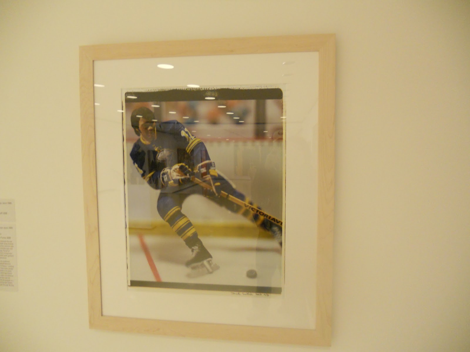

I also found a connection with the photograph above. Hockey and the sabres are on the type of my interests list. I love watching and going to games. My family is really big on hockey and a few family members play hockey, therefore it is a big part of my life.


This painting above really inspired me. This painting is done in all little splottches of different colors of paint. If you look close, you can tell in person. But in the picture and from far away, it is inspiring how tiny splottches of paint can create such a beautiful picture.
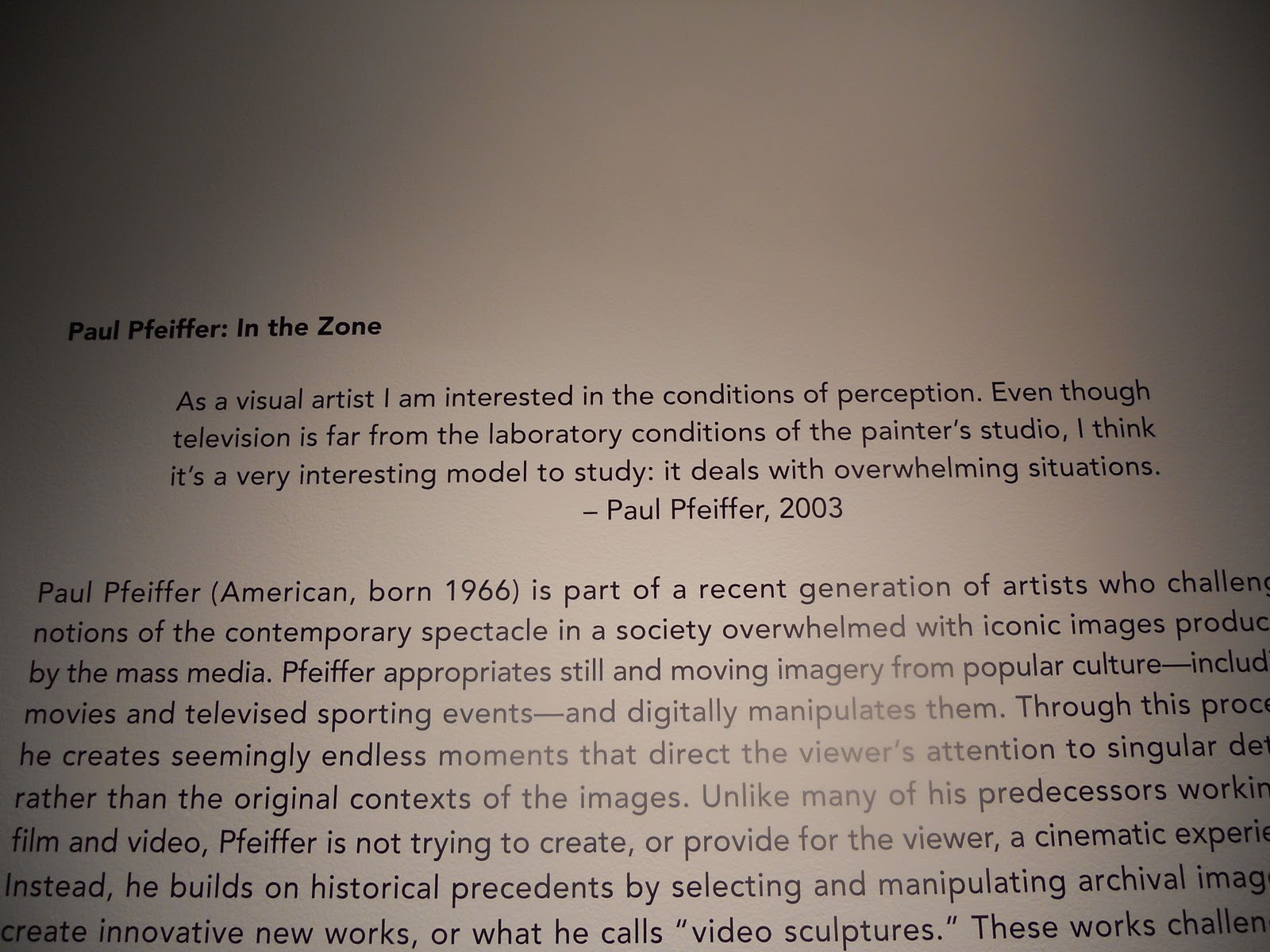


This exhibit room was a little creepy. I would like to know more about this work of art. The room was very empty but had a couple tvs with floating objects. Im not sure why it creeped me out but I also found it really unique and wanted to know more.


The picture above of this painting does not do it justice. I found this painting inspiring. Moses used techniques that really made the painting look like real velvet, it was very impressive. I almost had to go up to it and touch it to make sure it really wasn't.


This painting also inspired me. It looked very real and made me think about the concept of it. I thought back to the time of "indians" and thought how inspiring it was of them to do the primal things they did to survive. It really made me think how easy we have things now a days.


I found a connection with this painting, The Coming Storm. It is very dreary and even frightening. Sometimes, when I am having a bad day I can picture this to be my life. I sometimes feel like a big frightening storm is about to come and I need to relax and keep my head on straight.
Subscribe to:
Comments (Atom)